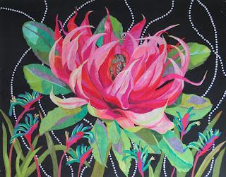
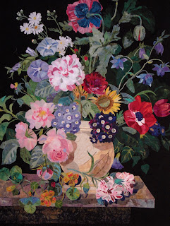
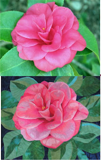
I’m writing this blog because I know many new-be quilters out there may need some guidance when choosing fabrics for a specific project. Specifically, one of my flower patterns or a landscaped, something that you want to give a realist/painterly look. It matters what kind of fabric you use. I’m going to speak specifically about my technique and using my flower patterns, but the concept works across the board. You can’t use any run-of-the-mill quilters stash for making these art quilts. So, what is my technique? I’m painting a painting using use fabrics. So, when you buy my patterns, you are to?
Batik fabrics were designed back in the day (thank you, Hoffman, of California); I had the idea of using them like paint because they had this watercolor feel, and I thought they would look like a painting. It is dyed in such a way to give a multi-colored and value feel like you look like it was painted, and they did, and they still do. Most realistic quilt artists use batiks and hand-dyed textures, even tone-on tones, to get that look.
First DON’T. Don’t use solid fabrics when you want a painterly look in your flower quilts. It doesn’t work. It gives a very flat look with no dimension. Now, if that’s what you want? Go for it. But my patterns were designed, and the pieces are layered to give a watercolor look by using the right kind of fabrics with fabrics. We want the viewer to come up close and say,” did they paint that?”
Now for all the solid fabric designers out there, I love
your fabrics and the colors. I buy them. They are beautiful. But not for making
my realistic flower or landscape quilt.
Use the color chart in the pattern as a color and value reference. Look at how the colors relate to each other.” Is this one darker or lighter than the one on top?
Do you have value in your fabrics? The range of lights to darks is so essential. Remember, dark colors reseed, and light colors come towards you, just like painting a still life. And my flower patterns are a “still life.” The value rules change when doing landscapes. We will talk about that at another time.
Don’t skip making the color chart in every pattern. The pattern instructed you to make the color chart in your chosen colors first. Please do it! It’s a visual reference guide to help as you build your flower. Very important.
I hope this helps you when making your flower quilts. I have
been working on turning some of my patterns into digital downloads, but I worry
you will use the wrong fabrics.
I use batiks and hand-dyed fabrics to make my quits look
like a painting without using paint. This is my secret for achieving that look.
When I had a student
bring their own fabrics to class, only 1% understood what to bring to class. But
99% of the students brought the wrong fabrics and went home unsuccessful. Not
good. When I started making kits for the classes, all were successful, and
learned how to make a flower look real by using the right fabrics. They
discovered that fabric is now a painting tool.
Check out my video above for more fabric information.
Remember being a quilter require us to have many kinds of
fabrics.


.jpg)


.jpg)


